 |
| Publishing a printed book is much less forgiving than producing an e-book. I have known that since I started working with electronic publishing, lo many years ago. But I really felt it with the production of my third book, Army of Worn Soles. |
I have printed books before, and I thought getting a print version of my third would be a piece of cake. And it was—until I made my own life my difficult by making the books itself more complex and using photographs within. No, it’s not hard to do, but getting the results you want means you have to follow some pretty strict guidelines.
Here are some of the lessons that I had to re-learn.
Use them when you prepare your own books for printing through CreateSpace, Lightning Source or any other printing service.
Word perspective
There are some things about document design and layout that I knew about even before I started writing.
- Use proper opening and closing quotation marks, not straight quotes/inch marks.
- Use real, curvy apostrophes, not inch marks instead of apostrophes.
- Double-check to make sure you’re using a real open quote ‘ instead of apostrophe ’. Most modern word processors like Microsoft Word and Pages automatically format these for you. If you’re not getting quotation marks at the beginning of the quote that point in the opposite direction from the marks at the end, go to your Preferences or Options menu and select “smart quotes.”
- Use the Ruler in your word processor, or the Styles menu, to indent the first line of paragraphs. —but remember not to indent the first paragraph after any heading or subheading. Don’t double-space paragraphs unless you’re writing a business guide or something similar. Definitely do not double-space paragraphs in fiction.
- Learn the differences between hyphens, en-dashes and em-dashes.
- Use the hyphen to join compound words, like “north-west.”
- En dashes are twice as long as hyphens. Use them to indicate a range in numbers, like “August 3–4.” You’ll enter it by typing Ctrl-hyphen or, on a Mac, Option-hyphen.
- An em-dash is twice as wide as the en-dash. Use it to break a sentence to indicate a new idea or a brief break in the logical flow—like this. Enter it with Shif-Alt-Hyphen, or on a Mac, Shift-Option-Hyphen. Decide whether you want to have spaces on either side of your em-dashes — like this — or not—like this—and use them consistently.
Come up to the page
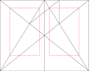
When I got my first job at a subsidiary of one of the Big Five publishing companies, I learned to think about book layout in terms of the two-page spread. When readers look at a book, usually they see a left, or verso page, next to a right, or recto. In the West, where we read left to right, we tend to start with a right-hand page, so the left is the back, or verso, of the right-hand page.
Left hand pages have even numbers, right pages have odd numbers, because we start page 1 on the right-hand side, then turn it over. Word allows “mirroring margins,” so that you have opposite left and right margins, and a different setting for the “gutter.”
Depending on whom you talk to, the outside margin—left on the verso (left) page, right on the recto—should be either wider or narrower than when laying out pages that are to be printed on one side only.
Createspace asks for a wider gutter—right margin on the left page, opposite on the other side— because of the perfect binding—the flat, glued spine of the book. With a thick, perfect-bound book, text too close to the spine is harder to read. Createspace offers a Word template that has a suggested width for left, right and gutter margins.
Headers and footers
With opposite pages, you can have opposite formats for headers and footers.
The first thing to realize here is that the first page of every document and every chapter has a different format. In Word, choose “Different first page” from the Layout menu. In Apple’s Pages, select Setup—Section—“Hide (Headers and footers) on first page of section.”
The second thing to remember is that left and right pages necessarily have opposite treatments of page numbering.
Traditionally, when it comes to fiction, publishers have not done much about this. Looking at some old books I have, I notice that typically, the verso page has the author’s name, while the recto bears the title of the book. Page numbers are centred on the bottom, or the footer.
With textbooks, on the other hand, the page number (folio, in publishing jargon) is on the outside corner —that is, on the far left of the header or footer of the left-hand/verso page, and on the far right of the recto.
Personally, I think it’s much better. Think about how you use a book. Pick up a print book, the one closest to you right now. Turn to page 96. How do you do that? You hold the book’s spine in one hand, and use the opposite thumb to flip through the pages. How much more difficult it will be to find page 96 if the folio were in the gutter, instead of on the outside?
Sometimes for very long books or anthologies, one header may have the name of the author of that chapter, while the other page has the title of the whole anthology, or sometimes the theme of the current section.
For example, my 1999 edition of Lord of the Rings, three-volume set has the book title (eg. The Fellowship of the Ring) on the left/verso, and the chapter title, eg. “A Short Cut to Mushrooms,” on the right/recto. The page numbers are on the outside corners of the header, and the footers are blank.
The textbooks that I worked on had a much more complex treatment. Headers or footers would show the part and chapter titles, along with the page number, in the outside corner.
It’s important to put the folio in the outside corner.
How to accomplish this
In Word or Pages, you can change the header and footer from one page to the next this way:
- Go to the Header and Footer or Page Layout menu and select “different first page.”
- Inserting a Section Break at the end of each chapter and deselect the “Continue from previous” button in the Header/Footer menu.
This gives you four areas to put four different kinds of information:
- book title
- part title
- chapter title
- author.
When I was writing my first novel, I sent a preliminary draft to a beta reader who had pretensions to being a publisher. I thought I would send something that would imitate a professionally printed book, as far as possible with the technology and my experience at the time, so I did those very things:
- set up facing pages
- put the folios (page numbers) on the outside corners
- put the name of the series of the book (The Dark Age) on the left (verso) footer
- put the name of the book (The Bones of the Earth) on the recto footer
- put the part title (Part 1, Initiation Rites; Part 2: Tests; Part 3: The Mission) on the left header
- put the chapter title in the right header.
The beta reader went ballistic on this. “What are you doing! A publisher just wants to see the page numbers in the header or the footer. This is way too fancy.” But why? It’s information that adds to the experience for the reader. If you don’t want to see it, don’t look—in fact, when we read a book, this fades into the background.
While Word makes this pretty straightforward, Apple’s Pages word processing program has no facing pages option, so this is very frustrating.
Take care with photographs
The photo of the author (me) in the print version of my first two books didn’t turn out so well. They looked great in the e-book, but muddy in physical form.
Turns out I made a rookie mistake, one I should have known better than to commit. I have worked for years in print, after all, and I remember telling other people to do this very thing: don’t print .jpg-format images.
If you have a photograph or any other image to print, you have to make sure that you’re sending the printer a file that will print well. Make sure you do at least these things:
- In your photo editor program, change the colour space to either Grayscale for black-and-white, or CMYK if you’re printing in colour.
- Set the resolution to at least 300 dpi. More isn’t really necessary, but less will look terrible.
- Save the image as a .TIFF or .EPS format file.
- Import the high-resolution .TIFF file into your word processor or page layout program.
- If you have to send the printer a PDF, make sure your resolution and colour space match the printer’s requirements. Make sure that the page layout program’s resolution for images is also set to at least 300 dpi, CMYK.
Lightning Source requires a PDF (Acrobat) format file. Here are some other settings to check before you upload your file:
- Page size—the default for your .pdf output is probably 8 ½ by 11 inches. This will not produce a book. Change the page dimensions, margins, bleed and trim settings to Lightning Source’s (or whichever printer you’re using) specifications.
- Page orientation—again, check whether the output will give you the results you expect. Test it on your own printer first.
- Fonts—if you’re using a special font, you will have to embed them in the .pdf. You can do this with the Printer settings.
Producing your printed cover is even more complex by a factor of magnitude. I’ll cover that in a future post.
For now, for those working on formatting their print books, this is just a place to start. But following these tips will get you past the initial errors that a lot of people make.
Tell me about your experiences in print.


